%20(3615%20x%202415%20px)%20(5).png)
After creating dashboards for 600+ clients as part of my consultancy, I have compiled a list of recommendations for the best Power BI visuals. I have applied these visualization principles to develop PowerBI data visualization dashboards for clients like Google, Teleperformance, and the UK Ministry of Defence.
In this article, I will showcase some of the best PowerBI visualizations I have created, explaining when they are most effective. We will explore different PowerBI visuals in detail, the best scenarios to use them and some of the power bi best design practices for reports and visuals.
There's a lot of cool graphs you can make in power bi but the best PowerBI visual is the one that effectively answers the business question being asked. So, this article will focus on selecting the right PowerBI custom visuals for various analytical needs.
What is Power BI
Power BI is a market-leading PowerBI data visualization software developed by Microsoft. Think of a BI chart as an Excel on steroids.
Like Excel, Power BI enables you to create pivot charts. However, it also allows for more complex formulas, enhanced PowerBI visualizations, and the ability to analyze large datasets efficiently.
A significant advantage of Power BI is its low-code approach, allowing users to build powerful dashboards and custom PowerBI visuals without any coding
Here is an extensive guide on Power BI, popular features, components, business intelligence charts, power bi best practices and real-world case studies. Feel free to read it in more details to learn more about Power BI and evaluate it for your organization.
Criteria for the Best PowerBI Visualizations
To be considered effective, a PowerBI visual should:
- Be easy to read, enabling quick comprehension of insights.
- Be intuitive so that users don’t require technical expertise.
- Be visually engaging, preventing audiences from losing interest.
With these criteria in mind, let's explore some of the most effective PowerBI custom visuals and their use cases so you don't have to pick a visual power bi reddit suggests.
16 Cool Graphs You Can Make In Power BI
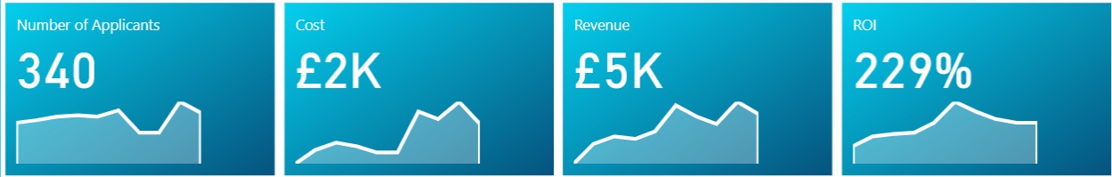
Cards - Quick Communication of Key Metrics
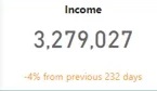
Card visualization is one of the best visualizations for Power BI when you want to quickly communicate the most important KPIs.
Imagine yourself as a CEO of a company. At any time you will have 3-4 metrics that will tell you whether your business is doing good or bad. When you open your Power BI dashboard you often want to quickly learn your performance on these key metrics. This is exactly what card visualizations are used for.
Card visualizations are often placed at the top and are the first thing that your users read after landing on your dashboard.
The downside of card visualizations is that they provide no context for your analysis. For example if your card visual shows income of $3M USD, is it good or bad? If you previously made $10M USD in the same time period, this is really bad but if you made $2M USD it is good!
This brings us to the next visualisation type that allows you to add context to your numbers.
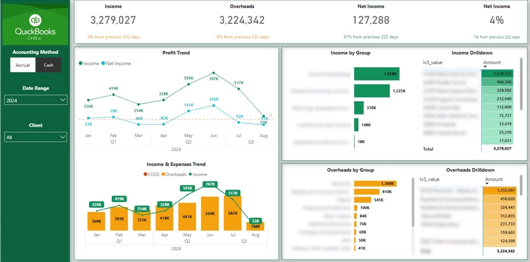
KPI Cards - Context-Driven Insights
KPI Cards are the best visualization for Power BI when you want to save space and concisely present key insights. They have the same use case as KPI cards while enabling you to add extra formatting features.
Power BI recently introduced the Card (new) visuals that enable developers to add trends, arrows and many other useful formatting elements!
I would encourage you to use the KPI cards if your users ask you to add more context to your cards graphs!
Line Charts - Change Over Time Visualization
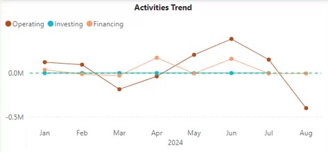
Line charts are the best visualization for Power BI when measuring the change over time for 2 reasons:
- Even when the change over time is minimal, the line slope will make it clear whether your numbers are going up or down.
- Even when your lines are close together you will still be able to easily see which line is higher. This is not the same with other type of trend charts.
You'll find no end to power bi visualization examples for line charts.
Line charts are only used to visualize change over time. Do not use them unless you X axis values imply some sort of trend! You don’t want to mislead your audience into believing that such trends exist when in reality they don’t.
Vertical Bar Charts - Data Distribution Analysis
Many data analysts would argue that vertical bar charts are the best power bi visual for comparison of distribution.
Every one of us has seen a tonne of vertical bar charts throughout our lives which means that we immediately know how to interpret them. As a result, vertical bar charts are easy to read and don’t require any technical knowledge to interpret!
They also double as the best power bi visuals for finance because of that exact simpicity to understand.
Vertical bar charts are also effectively used when you need to visualize trends. For example, consider the cash flow vertical bar chart below.
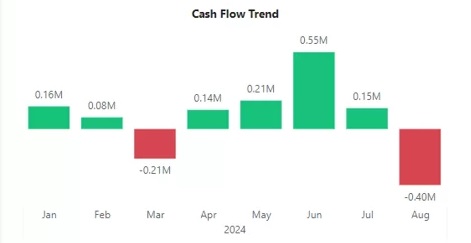
The rule of thumb for using vertical bar charts is that your items in the X-axis must be sorted in a logical order. For example months in the X-axis should be sorted chronologically. Without this condition vertical bar charts become really difficult to read!
Vertical Line and Column Charts - Dual Trends
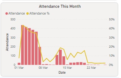
Vertical line and column charts are the best visualisation for Power BI when you have 2 separate trends to show. This visualization type allows you to have 2 separate Y axis which is useful when you have 2 different units of measurement.
Consider the chart above where we are visualizing attendance and attendance %. This chart allows us to use the columns for attendance and the line as percentage making both metrics easy to read!
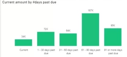
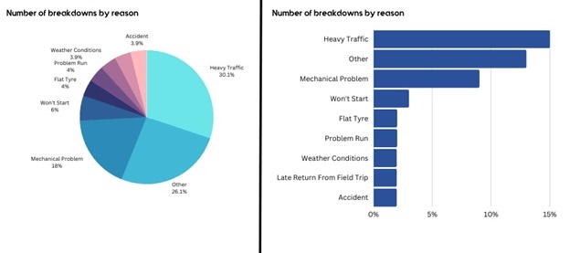
Horizontal Bar Charts - Categorical Breakdown

Horizontal bar charts are the best visualization for Power BI when analysing the categorical breakdown of your KPI. They offer multiple benefits over vertical bar charts:
- It is much easier to read long category names. Consider the chart above. Imagine how hard it would be to tilt your head and try to read these category names in a vertical bar chart.
- The horizontal bar charts don’t imply any logical order of the categories. Therefore, if your categories have no logical order to them, the vertical bar charts would work great!
- Horizontal bar charts look tidy even when you have a lot of categories.
Pie Charts - Intuitive Distribution for Small Categories
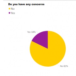
Pie charts are arguably the most hated visualisation method in the data analysis community. Many would advise you to never use pie charts at all. There are several arguments that support this point of view:
- Pie charts look messy when they have a lot of categories for the breakdown. You often can not see the category names when you have lots of categories in the pie chart.
- Pie charts make it difficult to visually compare segment sizes. It is often easier to read the same information in a horizontal bar chart.
Personally, I am not a pie chart hater. I feel pie charts just get misused a lot but the visualisation itself isn’t flawed. Pie charts also offer several advantages:
- You can show both % and real numbers in the pie chart data labels. You can’t do this in any type of bar chart.
- In my opinion pie charts are the most intuitive chart to read when you want to see distribution for 2-3 categories. They are great to visualise the answers to Yes/No questions or showing Male/Female split.
Donut Chart - Space for Additional Insights
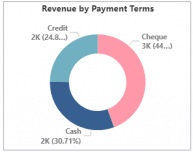
Donut charts are just another version of a pie chart. They have exactly the same benefits and drawbacks as pie charts which we won’t repeat in this section. The only difference is empty space in the middle of the chart.
You can make use of this empty space by placing a card visual inside. This way you will see the total for the analysed metric and it’s distribution across 2-3 categories.
Treemap - Button-Like Filtering
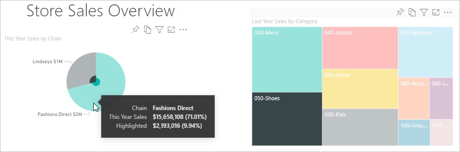
Another variation of a pie chart is a treemap. Again, it has all the same benefits and drawbacks. If you want a beautiful data visualization bi wise, this is a good direction to go with.
An advantage of a treemap is that it offers a button-like look. This means treemaps an intuitive visual for not only visualising distribution but also filtering all the other graphs.
A disadvantage of a treemap is that the small boxes make it difficult to read the text. An abundance of colors when you have many categories also makes them look intidy.
I would still use treemaps when you have 2-4 categories and you want to create interactive buttons to filter other graphs.
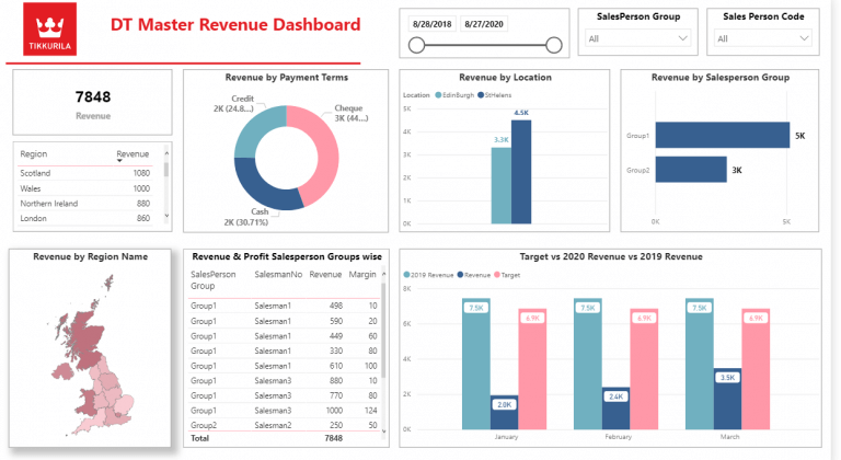
Table/Matrix - Most Common Visualization
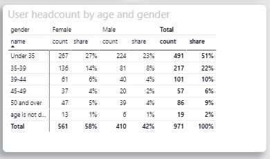
I feel like tables are the most underrated visualization for Power BI! Tables offer several key advantages as compared to other visualizations in Power BI!
- They look clean. No matter how many categories you have they look tidy and easy to read!
- They are extremely customizable. You can format the numbers inside of your tables more than in any other visualization! For example you can put the negative numbers in brackets, show both % and $ amounts in the same column, etc.
- Even small numbers are visible. In most data visualizations small numbers get lost and become barely visible but not with tables!
I would recommend to use the tables for detailed breakdowns and visualizing more than 3 metrics on the same graph.
For example the table below allows the users to have a clear visibility of numbers no matter if they are small or large. It also makes the analysis easy to read even though there are multiple metrics in the same graph.
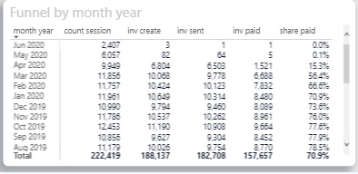
Funnel - Visualizing Step-by-Step Processes
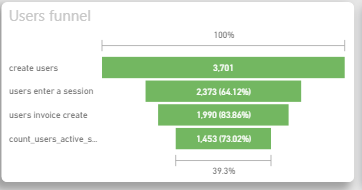
Typically this is one of those power bi chart types that people touch when there is a funnel-like business process. A very common mistake that I see is that funnel charts are used as another version of a bar chart. This is misleading the users into thinking that there is a funnel-like relationship between the categories when there isn’t one.
I would encourage the use of funnel charts for visualising business processes like sales pipeline or a hiring pipeline.
In addition, funnel charts allow to neatly compare the values in each funnel step vs the previous step. This offers a tidy way of visualising conversion rate in Power BI.
Ribbon Chart - Visualizing Data Trends
A Power BI ribbon chart is an excellent way to visualize data trends over time, showing how different categories contribute to a total. It uses ribbon-like bands to represent each category’s size and the change in their contribution across periods.
This chart is particularly useful for highlighting fluctuations in categories or comparing parts of a whole over time.
It's really ideal for showcasing performance, market share, or sales trends, where you want to emphasize the relationship between different categories in your dataset.

Bubble Maps - Engaging Geographic Insights
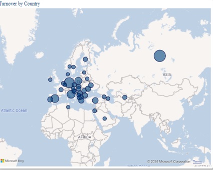
Bubble maps are the best visualization for Power BI when your goal is to show the geographic distribution in an engaging way. Maps make your Power BI page look a lot more engaging in general!
Power BI uses bing maps integration which means that simply having city and country names in enough to create a map.
The disadvantage of bubble maps is that bubble sizes may be difficult to compare to each other. Because of this it is ofter a good idea to supplement a map with a table.
An advantage of bubble maps is that you can turn your bubbles into mini pie charts adding an extra layer of analysis to the same visual!
Filled Maps - Colour Density based Geographic Comparisons
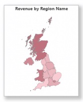
Filled map are the best visualization for Power BI when you want a tidy way to show geographic distribution. In my opinion they look tidier than bubble maps since many bubbles overlapping often overwhelm the users. I feel that it is easier to compare the color gradient than bubble sizes.
I would encourage you to use filled maps wherever you need to compare different regions of the same country. I would also encourage you to add a table next to your map to make the numbers easier to read. It's also one of the more beautiful data visualization bi has to offer.
The Best Visualization for Power BI Depends on Context
As you can see the choice of the best visualization for Power BI depends on the business question. I hope that this article helps you determine which Power BI visualization are best for your particular use case and that's why you need PowerBI Data Connectors.
If you are still unsure how to effectively visualise your data in Power BI, it might be worth it for you to speak to a professional Power BI consultancy. After completing dashboards for 600+ clients we can quickly understand your data, business questions and the effective way to visualise it and even run automations on it using Konnectify.
I hope that you enjoyed this article and hoping to see you again on the Konnectify blog!